There are many components to the WritheM brand – this is where you will find the logo details, components and guidelines in using the logo.
Identifying which logos are which
The following logos are named hereafter as the following:
WritheM Black |
WritheM Inverse |
WritheM Monochrome |
|---|---|---|
 |
 |
 |
Some important notes about using the WritheM logo.
Say no to taglines
We don't do taglines. If you feel you must include a tagline, place it away from the logo. The logo is strong enough to stand on it's own.
Which logo should you use?
Only use the monochrome logotype when the black logotype or reverse logotype (versions with red M) cannot be used for cost or productive reasons.
WritheM Black - White and light backgrounds, online and most printed collateral.
WritheM Inverse - Dark-colour backgrounds.
WritheM Monochrome - One-colour applications such as black and white newspaper ads.
A note about inconsistent backgrounds
Sometimes we need to put the WritheM logotype on a photo or other inconsistently coloured background image... however because the WRITHE part of the logo is transparent, without further manipulation, the image would be difficult to read. If this is the case, you can take any single solid colour from the image of your choice and create a solid box behind the logo. This will improve the readability of the logo while still maintaining the 'transparent' effect of the logotype.

Download the logos
When you are sending or distributing our logo to someone to use in their own materials always ensure to include a link to this document.
Colour
There are very specific colours being utilized in the logo. The following are the colours that must be utilized.


- Slate - Used in the Black logotypes as the box colour
- Porcelain - Used in the Inverse logotype as the box colour, and in the Monochrome logotype as the WRITHE fill.
- Crimson - Used in the Black/Inverse logotypes as the M colour
- M Grey - Only used in the Monochrome logotype as the M colour
Font
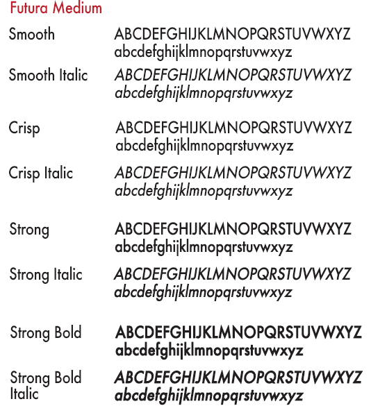
Futura Medium is the WritheM font. It's clean, it's fresh, and it's timeless; and when use consistently, it strengthens our brand.

Sponsorships and partnerships
When showcasing WritheM with another logo, the WritheM logotype should be on the right; the partner logo should be on the left. And the logos should be separated by a divider. You must also use one of the 3 WritheM logotypes definned above.


Divisions, Products, and Services of WritheM
There are many divisions and products from WritheM that sometimes require their own logo. You may alter the text line below the WRITHEM box, while abiding by these few rules:
- We still say no to taglines.
- The text should only include the title of the product, service or division.
- The text length can not surpass the width of the box above it.
- You must not alter the font/sizing of the text.
- If the lower text line cannot be altered the WEB SOLUTIONS version must be used.
Here are a couple examples of proper usage for the Product/Service/Division alternatives.


Favourites icon
In select cases it's also important that websites identify themselves to have a logo to the browser. This logo should not be modified in anyway and will represent the WritheM Brand to all divisions, for all services and all products. This logo is typically only 16px2
